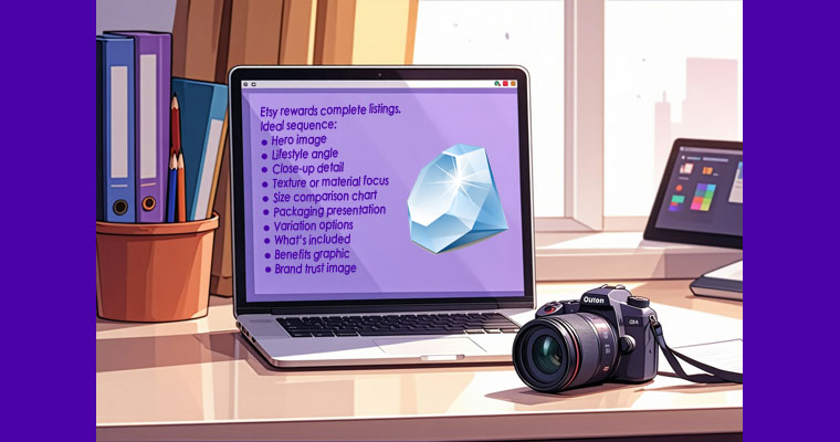
If your Etsy traffic is decent but sales feel inconsistent, your images are likely the bottleneck.
On Etsy, images do two critical jobs:
Win the click (CTR – Click-Through Rate)
Win the purchase (Conversion Rate)
This guide walks you through optimizing your Etsy images for both SEO performance and buyer psychology, so your listings don’t just look nice — they sell.
Why Etsy Images Matter More Than You Think
Etsy is a visual search engine.
Before a buyer reads your:
Title
Tags
Description
Reviews
They see your first image.
If it doesn’t:
Grab attention
Clearly communicate the product
Look trustworthy and premium
They scroll.
High-performing images improve:
Click-through rate (CTR)
Time spent on listing
Favorites
Conversion rate
Indirectly: ranking performance
Part 1: Optimize for Click-Through Rate (CTR)
Your first image is your billboard.
1️⃣ Fill the Frame
Your product should occupy 70–85% of the image.
Avoid:
Too much empty background
Tiny product in large room
Excess negative space
Buyers scroll quickly — small products get ignored.
2️⃣ Use the Right Aspect Ratio
Best practice:
4:5 vertical format
2000px shortest side minimum
This maximizes screen real estate on both desktop and mobile.
3️⃣ Increase Brightness & Contrast
Most Etsy images fail because they’re:
Slightly dim
Slightly grey
Slightly flat
Fix:
Exposure +0.3 to +0.6
Contrast +10–15
Clarity +5–10
Slight warmth adjustment
Clean whites signal quality.
4️⃣ Simplify the Background
Busy kitchens, textured walls, and cluttered tables distract.
Best-performing backgrounds:
Soft beige
Light grey
Clean white
Subtle gradient
If lifestyle context is important, keep it minimal and blur slightly.
5️⃣ Add Strategic Text Overlay (When Appropriate)
Use sparingly.
Examples:
Digital Download
Personalized
Set of 4
Airtight Glass Jars
Rules:
Minimal font
High readability
No clutter
Positioned in empty space
Done right, overlays increase clarity and reduce buyer confusion.
Part 2: Optimize for Conversion
Once someone clicks, your remaining images must eliminate doubt.